Portable barrier-free delivery systems have evolved beyond being simply functional. Today, these barrier-free systems are an important part of not only providing privacy but also enhancing the aesthetics, branding, and mood in commercial and public restrooms.
Here at Ryka Restroom Cubicles, we believe that even functional environments warrant critical design thought, creativity, and attention to detail. One of the easiest and most impactful ways to transform your restroom space is through color. Whether you are outfitting a shopping center, hospital, airport, or office building, a carefully chosen color combination can improve user experience, convey brand values, and even improve perceived cleanliness.
In this blog post, we are going to take a closer look at 9 beautiful color combinations for your cubicle partition designs that are not only attractive but also practical, versatile, and timeless, and can be used in almost any environment.
1. Monochrome Opulence: Charcoal Grey + Matte Black
A classic monochrome palette offers sophistication & minimalism. Charcoal grey panels with matte black framing or hardware give a sharp, clean look that feels both modern and luxe.
Best For:
- Corporate restrooms
- Airport lounges
- Premium office spaces
Why Does It Work?
- Grey allows a somewhat neutral base that is not too overpowering.
- Black accents provide depth and contrast and will not overpower the space.
- Matte finishes minimize fingerprints.
Bonus Tip:
Consider adding subtle LED light strips under cubicle lines for a highly modern finish.
2. Natural Calm: Sandstone Beige + Woodgrain Texture
This combination provides a warm, organic look that quickly softens the restroom space. Beige panels with a vertical woodgrain texture simulate the look of natural wood without the heavy maintenance.
Best For:
- Hospitals and clinics
- Wellness centers
- Boutique hotels
- High-end residential buildings
Why It Works:
- Beige is soothing and clean.
- Wood textures create tactile warmth and visual appeal.
- The combination of these colors fits easily with neutral surfaces and soft light.
Material Suggestion from Ryka Restroom Cubicles:
Our compact laminate panels with a woodgrain finish are perfect for this look – moisture-resistant, easy to clean, and exceptionally durable.
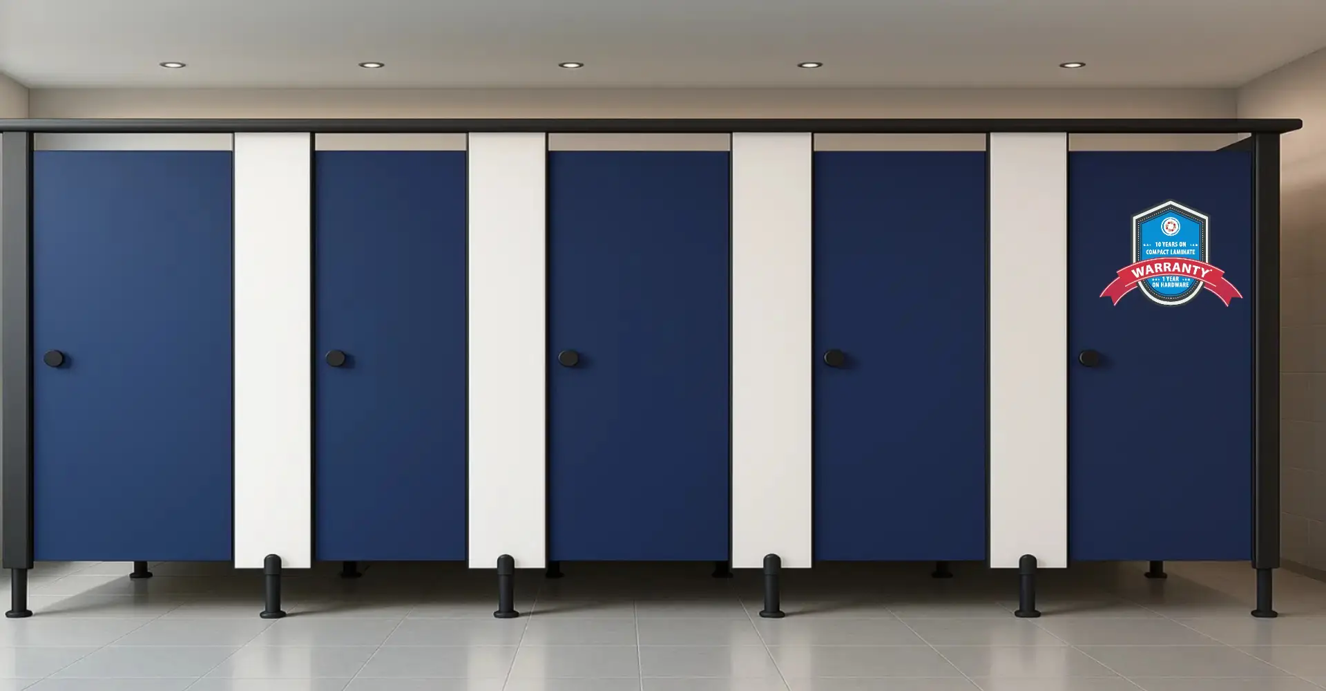
3. High-Contrast Classic: White and Navy Blue
This bold, high-contrast scheme feels both classic and nautical-modern at the same time. Navy colours add depth and strength, while white colours provide brightness and a sense of hygiene.
Best For:
- Government buildings
- Hotels and conference facilities
- High-end retail malls
Why It Works:
- White surfaces create a sense of hygiene and openness.
- Navy makes a serious statement and adds authority, but it is less severe than black.
- This combination feels timeless yet modern.
Styling Ideas:
Apply stainless steel or brushed aluminum fixtures to balance the dark tones and create a uniform look.
4. Urban Industrial: Graphite Grey + Brushed Steel
This combo is tough, simplistic, and still very in style with contemporary architecture. Graphite partitions with brushed steel accents or frames offer a utilitarian, raw edge appropriate to industrial-style structures.
Best for:
- Creative workspaces
- Breweries or the food court
- Airports & stadiums
- Art galleries
Why it works:
- Industrial style shows strength and durability.
- Neutral tones work with concrete, exposed pipes, and steel.
- Brushed steel isn’t corrosive and easy to maintain.
Tip from Ryka Restroom Cubicles:
Ask us about our anti-fingerprint steel panels to reduce smudges in high-traffic areas.
5. Refreshing Shades: Mint Green + Light Grey
If you’re looking to create a calming, refreshing space, mint green and light grey are an excellent combination. These pastels are clean, gender-neutral, and psychologically calming.
Best For:
- Schools
- Libraries
- Co-working spaces
- Fitness centers
Why It Works:
- Green is related to calm, health, and sustainability.
- Grey grounds the design while remaining light.
- Both colors are light enough to visually expand small spaces.
Design Tip:
To reduce glare, use textured or semi-matte finishes, and to provide depth of color.
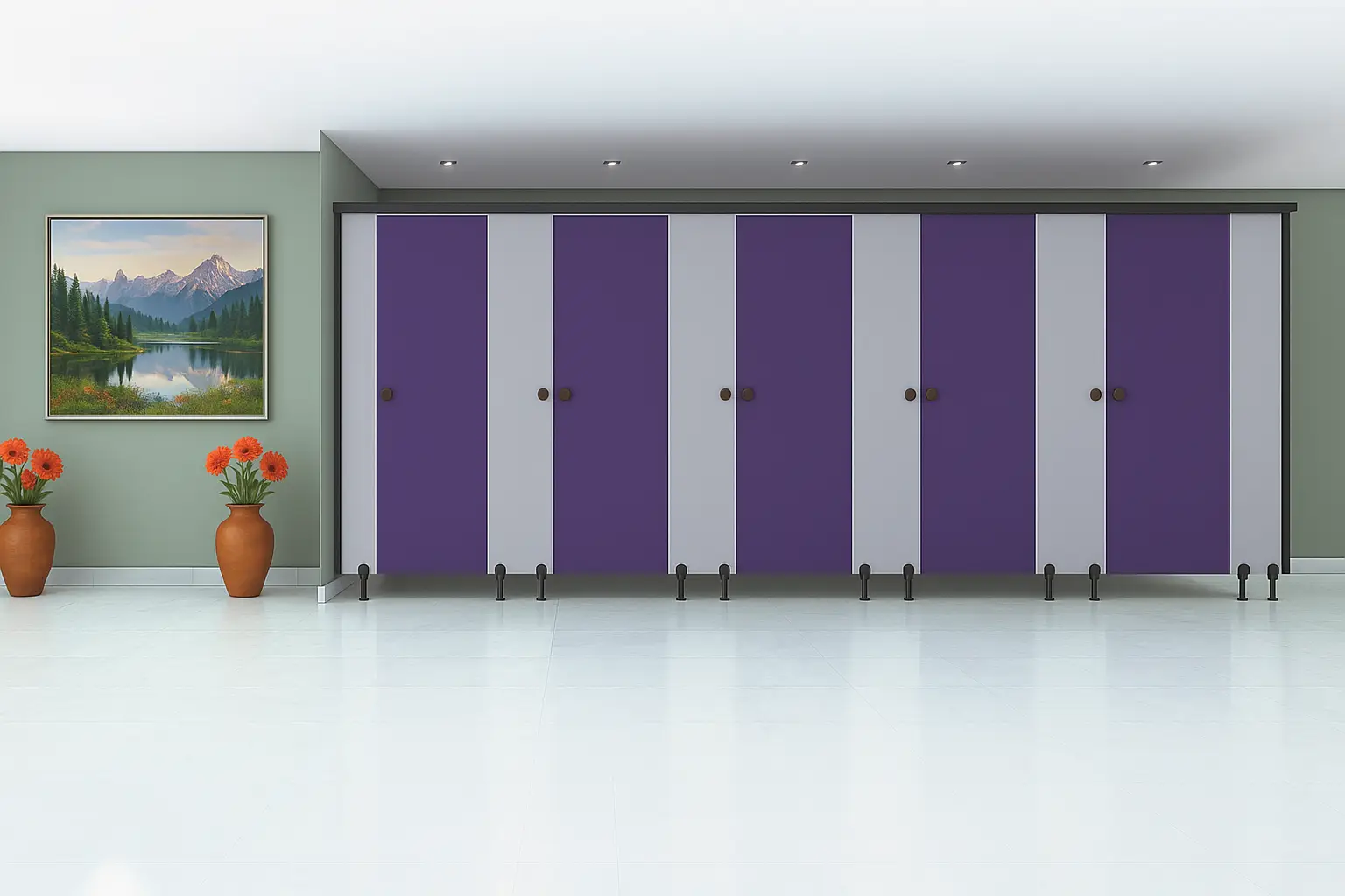
6. Subdued Elegance: Taupe + Ivory White
This scheme is elegant, simple, and timeless. Taupe (brownish-grey) has a warm, mature lightness, balanced by the soft, nearly creamy lightness of ivory.
Best For:
- Luxury hotels
- Executive lounges
- High-end restaurants
- Casinos
Why It Works:
- Neutral tones are ageless and adapt to almost any architectural style.
- This palette is lovely in naturally illuminated lighting.
- Feels clean yet avoids a clinical feel of stark white.
Maintenance Tip:
Choose anti-bacterial laminate finishes from Ryka for maintenance and hygiene compliance.
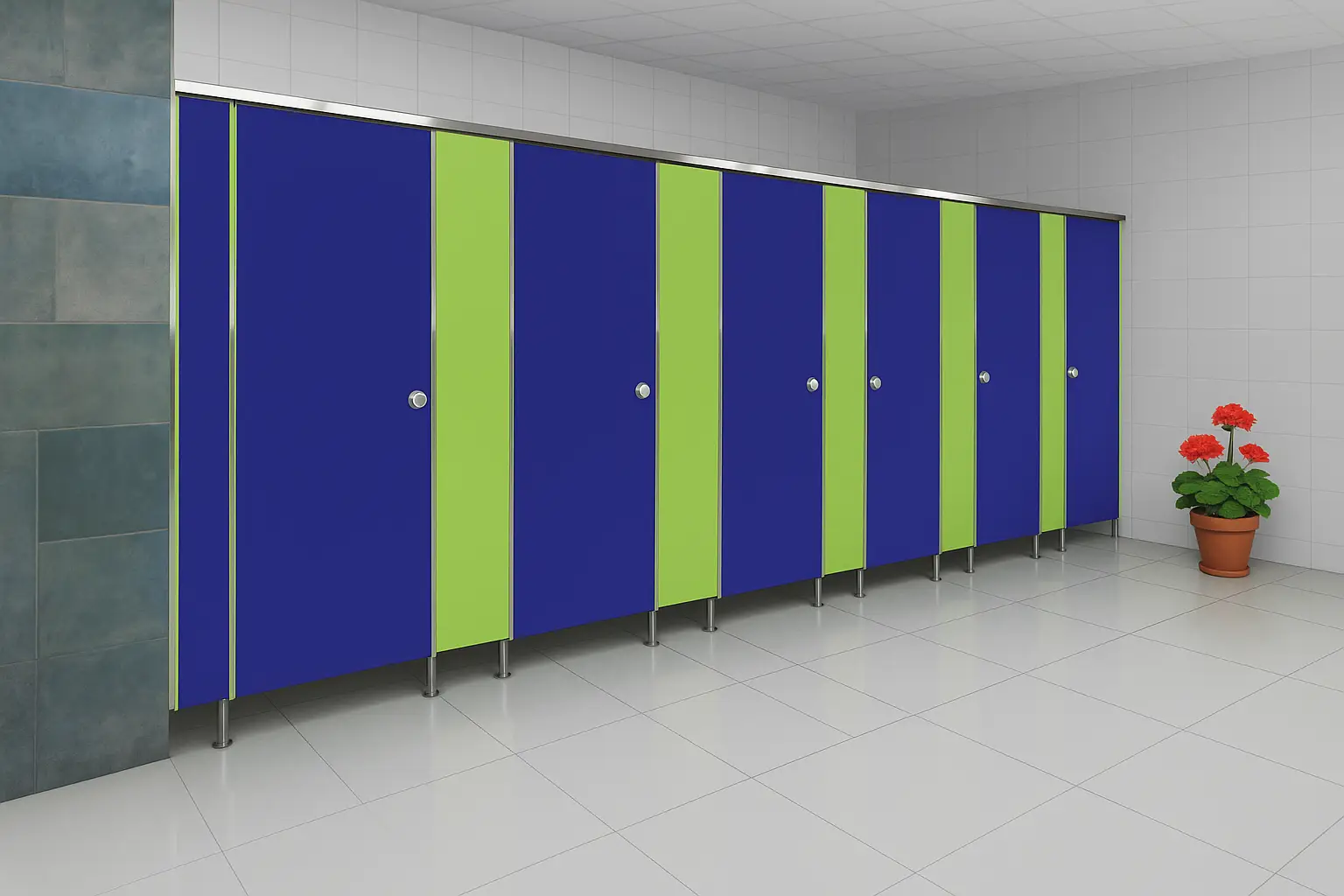
7. Memorable Branding: Custom Corporate Color Schemes
Your toilet cubicle partition can break a pattern! Why not use your brand’s primary or accent colors? This leverages your brand identity and makes your amenities more distinctive.
Best For:
- Corporate HQs
- Franchises
- Sporting arenas
- Entertainment parks
Why It Works:
- Provides brand consistency at all touchpoints.
- Provides a marked difference between your restroom and other generic public sets.
- Creates a feeling of familiarity and professionalism.
Ryka Custom Options:
We deliver color matching, vinyl, and branded graphics to support your unique visual identity for restroom design.
8. Scandinavian Simplicity: Light Oak + Ice White
Scandinavian design is known for its simplicity, minimalism, and functionality. Light oak with icy white panels achieves a cool, airy look that’s ideal for creative or boutique settings.
Best For:
- Startups and creative studios
- Artisan cafes
- Co-living and co-working spaces
- Art schools
Why It Works:
- Light wood tones create a soft, organic feel.
- White adds a sense of cleanliness and openness.
- This combo reflects natural light beautifully.
Bonus Design Tip:
Combine with matte black door handles or frames for a modern Nordic edge.
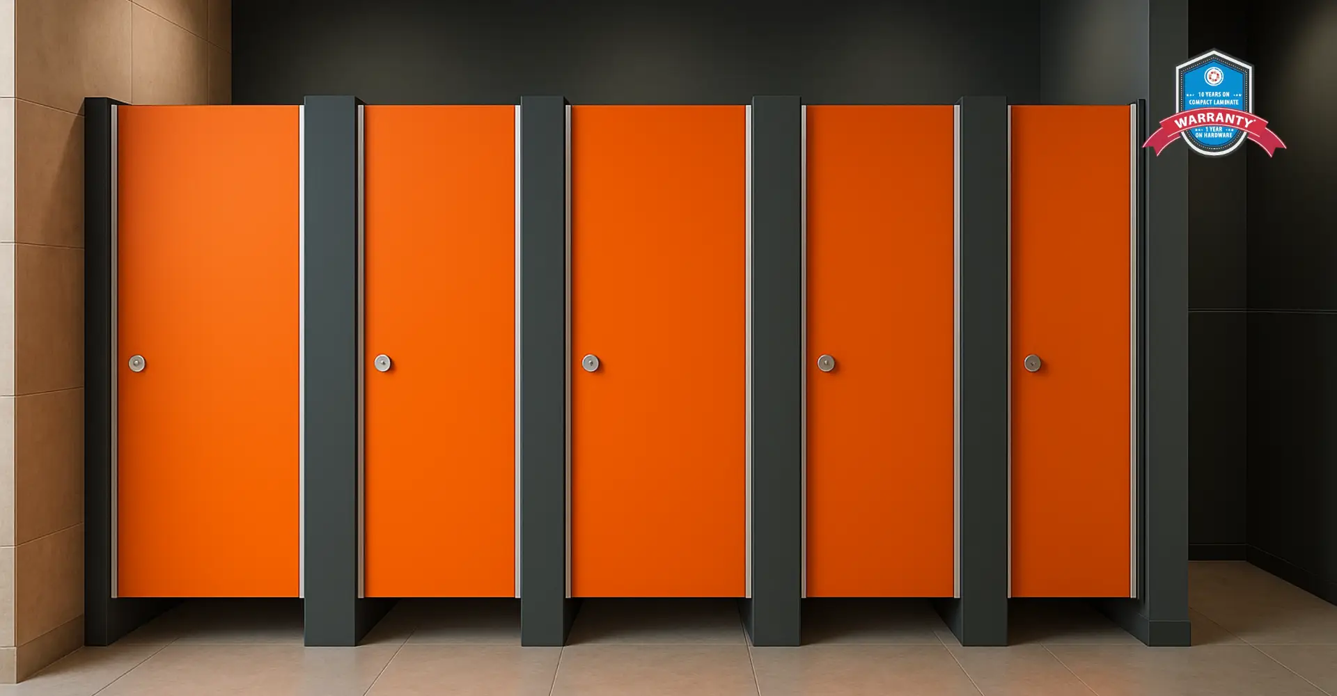
9. Bold Energy: Deep Red + Matte Black
For an energetic, edgy look that makes a statement, deep red and matte black bring in high contrast and dramatic flair. This duo is perfect for venues that want to stand out and attract younger audiences.
Best For:
- Clubs and cinemas
- University campuses
- Game zones
- Gyms and sports clubs
Why It Works:
- Red evokes power, urgency, and attention.
- Black anchors the design and gives it weight.
- Together, they create a bold, energetic environment.
Pro Design Insight:
Use red selectively—such as on door panels only—with black for partitions to maintain balance and avoid visual fatigue.
The Power of Design in Toilet Cubicle Partition Systems
Color is not just about style—it impacts perception, behavior, and user satisfaction.
Here’s how:
- Bright tones (white, light grey) enhance perceived hygiene.
- Warm neutrals (beige, taupe) make spaces feel welcoming.
- Bold hues (navy, red) create memorable user experiences.
- Natural colors (woodgrain, green) promote calmness and well-being.
Why Choose Ryka Restroom Cubicles?
At Ryka Restroom Cubicles, we understand that a modern toilet cubicles partition system must check all boxes:
- Aesthetic appeal
- Structural integrity
- Moisture resistance
- Low maintenance
- Hygiene compliance
- Customization options
Whether you’re an architect, builder, or facility manager, we’re here to guide you through material selection, color planning, layout optimization, and branding integration.
Our Custom Offerings Include:
- HPL & compact laminate in 100+ finishes
- Stainless steel and powder-coated metal frames
- CNC-routed logo and signage integrations
- Modular systems for fast installation
- ADA-compliant cubicle designs
- Eco-friendly material options
Final Thoughts: Design With Purpose
Toilet cubicle partition systems are often overlooked during commercial interior design, but they are one of the most-used spaces in any building. A thoughtfully designed cubicle area with modern color schemes can elevate the restroom experience for your visitors, reflect your brand values, and set your space apart.
When you work with Ryka Restroom Cubicles, you’re not just choosing durability—you’re choosing design-led, high-performance systems that leave a lasting impression.