
Introduction: Why Color Matters More Than You Think
Have you ever walked into a restroom and instantly felt calm, refreshed, or even slightly uncomfortable — but couldn’t figure out why? The answer often lies in color psychology.
Color isn’t just decoration. It’s a powerful emotional and behavioral cue, influencing how people feel and interact with spaces. In environments like restrooms — especially those in workplaces, malls, schools, or airports — the right color choices can make a remarkable difference in comfort, perception, and user satisfaction.
As a leading Toilet Cubicles Partition Manufacturer, Ryka Restroom Cubicles understands that restroom design isn’t just about durability and hygiene — it’s about creating spaces people feel good in.
In this detailed guide, we’ll explore how color psychology plays a crucial role in restroom design, how brands can use color to express identity, and what the most effective color palettes are for different types of facilities.
The Science Behind Color Psychology
Let’s start with a common voice-search question:
“What is color psychology, and how does it apply to restroom design?”
Color psychology studies how colors influence human emotions and behavior. For example:
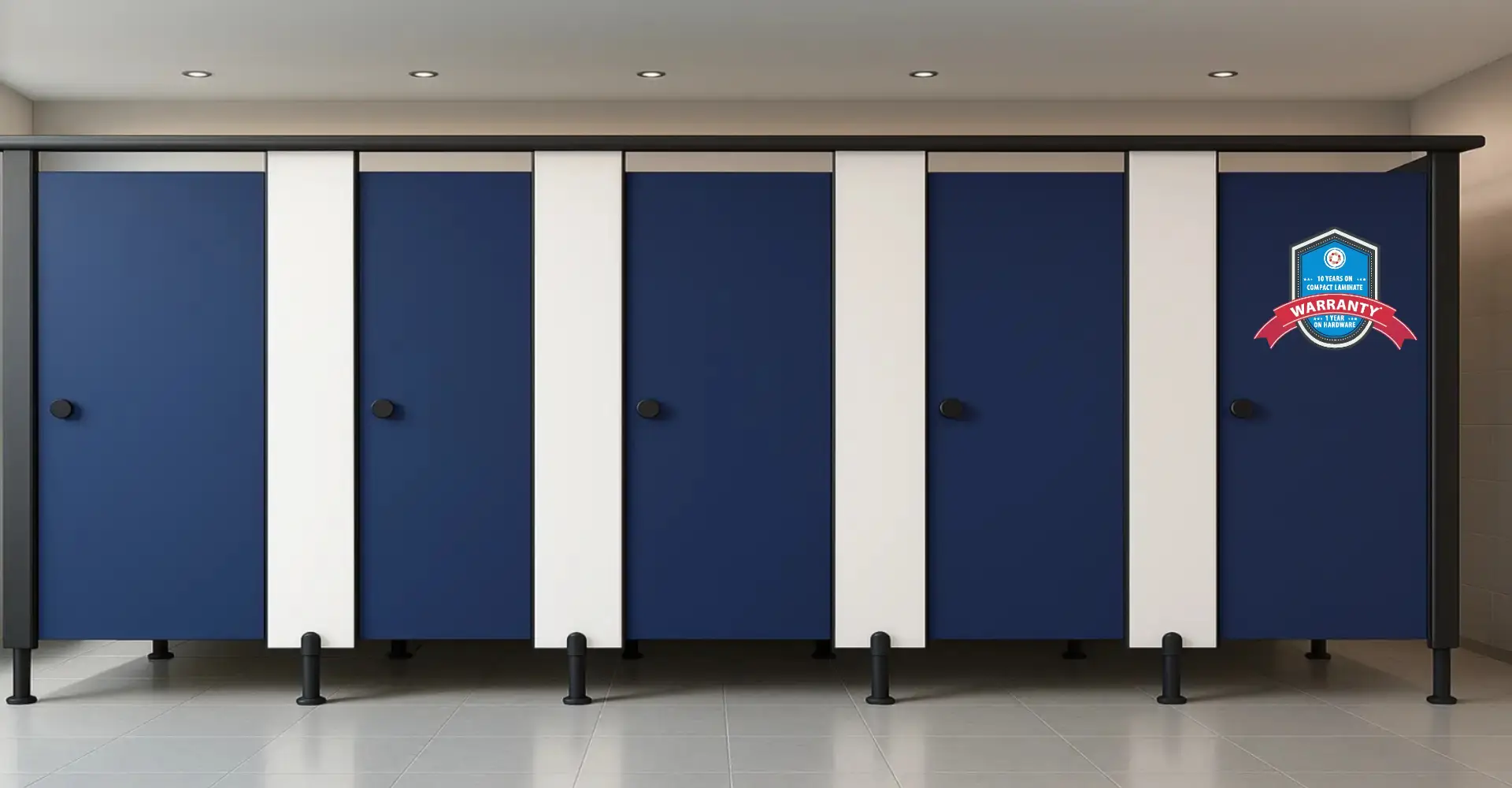
- Blue is calming and trustworthy.
- Green symbolizes freshness and balance.
- Red creates energy and urgency.
- White evokes purity and cleanliness.
In a restroom, these associations directly affect user perception — how clean the space feels, how safe it seems, and even how long someone stays inside.
Research from environmental psychology shows that subtle color shifts can influence mood, stress levels, and overall satisfaction. That’s why choosing the right palette for toilet cubicles is not just aesthetic — it’s strategic.
Understanding How Users Experience Color in Restrooms
When users enter a restroom, they experience it holistically — light, layout, smell, and color all work together.
As a Toilet Cubicles Partition Manufacturer, Ryka Restroom Cubicles considers how colors behave under artificial light, reflect off materials, and affect space perception.
For example:
- Dark colors can make cubicles feel more private but smaller.
- Light tones create a sense of openness but may highlight dirt faster.
- Matte finishes feel warm and subtle; glossy finishes reflect light, enhancing brightness.
Voice Search Insight:
“Which colors make restrooms look cleaner?”
The answer is neutral tones — shades like soft gray, ivory, and light blue tend to look fresh and clean even after hours of use. This is why Ryka often recommends light neutrals with accent tones for corporate or hospitality clients.
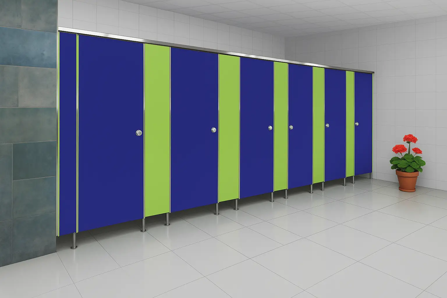
Calming the Mind: Using Blues and Greens
One of the most effective ways to enhance user comfort is through cool colors like blue and green.
Blue reminds us of the sky and water — both naturally soothing elements. It slows down breathing, reduces stress, and promotes a sense of cleanliness. Green, on the other hand, connects with nature and promotes relaxation and renewal.
In high-traffic environments such as airports or hospitals, these colors can subconsciously reduce anxiety.
At Ryka Restroom Cubicles, we often use soft aqua blues or sage greens for spaces where users need to feel calm — such as wellness centers, hospitals, or educational institutions.
Example:
When a wellness spa in Pune installed Ryka’s pastel green cubicles, customer feedback showed a noticeable rise in comfort and satisfaction. The management team later expanded the same palette to their locker areas for consistency.
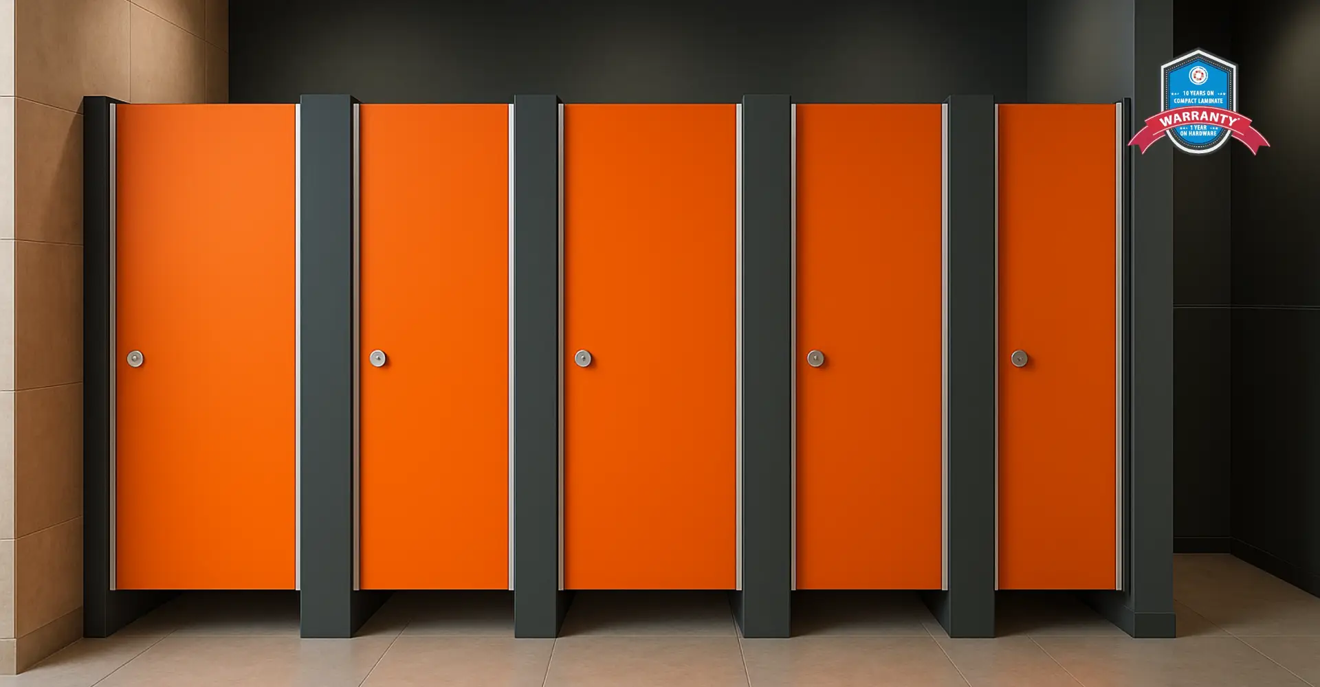
Energizing Spaces with Warm Tones
Let’s address another common voice-search query:
“Can bright colors make restrooms look more welcoming?”
Yes — if used thoughtfully.
Warm colors like yellow, coral, and light orange can bring vibrancy and positivity. However, too much intensity can overwhelm the senses. That’s why Ryka’s design experts often recommend using warm tones as accents — for example, just on cubicle doors or divider panels.
These colors are perfect for places that want to project energy and optimism — such as corporate campuses, cafes, or youth-centric retail spaces.
In one project for a leading IT park in Hyderabad, Ryka Restroom Cubicles introduced soft yellow panels paired with matte white partitions, creating an energetic yet balanced vibe that aligned perfectly with the brand’s creative culture.
Neutral Tones: The Universal Language of Cleanliness
Ever wonder:
“Why are most modern restrooms white, beige, or gray?”
That’s because neutral tones are timeless and evoke immediate cleanliness. They also make maintenance easier since they conceal minor stains or scratches better than darker shades.
At Ryka Restroom Cubicles, we recommend neutral palettes for high-traffic facilities — airports, malls, and educational institutions — where cleanliness and durability are top priorities.
Best Neutral Combinations for Restrooms:
- White & Charcoal Gray: Sleek, modern, and low-maintenance.
- Ivory & Taupe: Warm and welcoming without overpowering brightness.
- Beige & Metallic Accents: Adds luxury while keeping things subtle.
These color schemes also allow flexibility — you can easily change signage or branding elements without redoing the entire color plan.
Reflecting Brand Identity Through Color
A growing number of businesses are now asking:
“Can restroom cubicles match our brand’s colors?”
Absolutely — and it’s one of the easiest ways to reinforce brand identity across every user touchpoint.
Corporate and retail brands today recognize restrooms as part of the brand experience. If a user’s experience inside your restroom matches your brand tone — elegant, energetic, eco-friendly — it leaves a lasting impression.
For instance, a premium restaurant chain in Mumbai approached Ryka Restroom Cubicles to create cubicles that reflected their brand’s deep red and gold palette. By balancing those warm colors with neutral beige walls, the final look was rich but not overwhelming — sophisticated yet inviting.
This is where Ryka’s customization expertise shines as a Toilet Cubicles Partition Manufacturer — every panel, hinge, and finish can be customized to echo your brand’s design language.
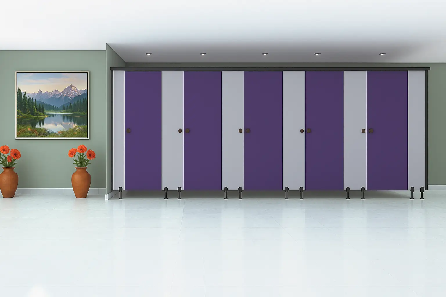
Color Psychology and Gender-Neutral Design
As inclusivity becomes a design priority, many architects ask:
“What colors work best for gender-neutral restrooms?”
Traditionally, men’s restrooms were blue and women’s were pink or red. But in today’s inclusive design era, such distinctions are outdated.
Neutral colors like slate gray, sand, olive, and muted teal now define modern gender-neutral washrooms. They create a balanced environment that’s welcoming to everyone.
Ryka Restroom Cubicles has worked with several multinational offices to design gender-neutral cubicles that feel safe, modern, and balanced — often blending earthy tones with wood-textured finishes for warmth and inclusivity.
Lighting and Finish: The Unsung Heroes
Color psychology doesn’t work in isolation — it depends heavily on lighting and finish.
“How does lighting affect restroom color design?”
Warm lighting enhances earthy tones, while cool lighting brings out blues, whites, and grays. Choosing the wrong combination can distort the entire aesthetic.
That’s why Ryka Restroom Cubicles collaborates closely with lighting consultants to ensure the final ambiance feels cohesive and natural.
In addition, matte finishes are often preferred over glossy ones for restrooms because they minimize glare and hide fingerprints — maintaining a consistently clean look.
Material Choices and Longevity
Color also affects material perception and durability. Darker shades hide wear and tear better but can make spaces look smaller. Light colors, on the other hand, make rooms appear bigger but may require more frequent cleaning.
Ryka Restroom Cubicles solves this by using compact laminate panels that are UV-resistant and easy to clean, ensuring colors stay vibrant for years — even under harsh cleaning cycles.
For premium environments, Ryka also offers anti-fingerprint finishes that retain the elegance of dark tones without the usual maintenance hassle.
Cultural Influence in Color Preferences
Another fascinating voice-search question is:
“Do color preferences in restroom design vary by culture?”
Yes — they do.
In India, for instance, bright colors are often associated with positivity and festivity. But in Scandinavian or Japanese-inspired architecture, designers prefer minimalist, muted tones to reflect calm and order.
Ryka Restroom Cubicles often adapts color recommendations to regional and cultural expectations — ensuring every project feels locally relevant yet globally elegant.
For example, in educational institutions in southern India, Ryka uses lively blues and greens for younger demographics, while corporate spaces in metro cities prefer subtle gray or beige palettes.
Emotional Wellbeing and User Comfort
Why does all this matter? Because colors have a direct impact on emotional wellbeing.
A calm, well-colored restroom subconsciously improves mood and reduces stress — especially in places like hospitals, schools, and airports where users may already feel anxious.
At Ryka Restroom Cubicles, color selection goes hand-in-hand with ergonomic design to enhance psychological comfort. This results in spaces that are not only functional but also emotionally reassuring — a small but vital part of a better user experience.
The Future of Restroom Color Design
As trends evolve, color psychology is merging with smart design and sustainability.
We’re now seeing:
- Sensor-based lighting that adjusts tone based on natural light.
- Biophilic design integrating nature-inspired greens and browns.
- Custom-printed panels featuring brand motifs or calming patterns.
Ryka Restroom Cubicles stays ahead by offering fully customizable cubicle designs, combining psychology, technology, and aesthetic excellence to create restrooms that both look and feel right.
Conclusion: Designing Restrooms That Resonate
To sum up, color is not just a visual choice — it’s an emotional language. It influences how users perceive hygiene, comfort, and even the brand behind the space.
Choosing the right palette for toilet cubicles isn’t about trends — it’s about understanding human psychology, cultural nuances, and the unique goals of your facility.
At Ryka Restroom Cubicles, we don’t just manufacture partitions — we design experiences. With our expertise as a top Toilet Cubicles Partition Manufacturer, we help architects and facility owners craft restrooms that feel as good as they function.
Because every color tells a story — and the right one leaves a lasting impression.